
AERNINE ENERGY DRINK
AERNINE ENERGY DRINK
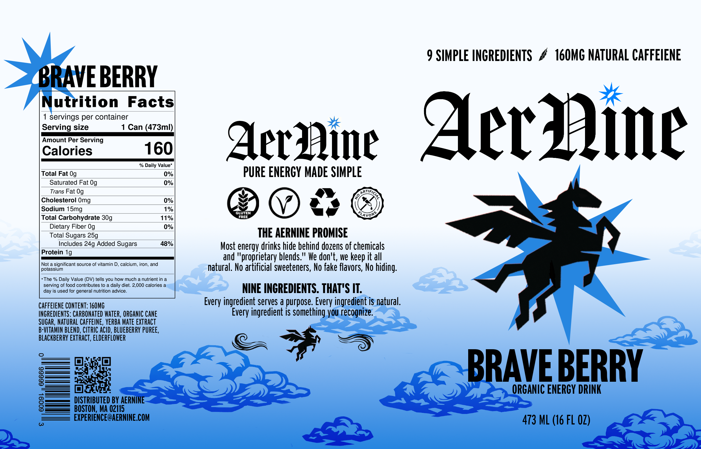
ABOUT
Context: This personal project was in response to a lack of understanding surrounding photoshop and the act of creating mock-ups for objects.
Audience: This project wasn’t built with anyone in mind to begin with but as the project continued a theme or audience began to came to mind which ended up being atheletes or those who want clean energy.
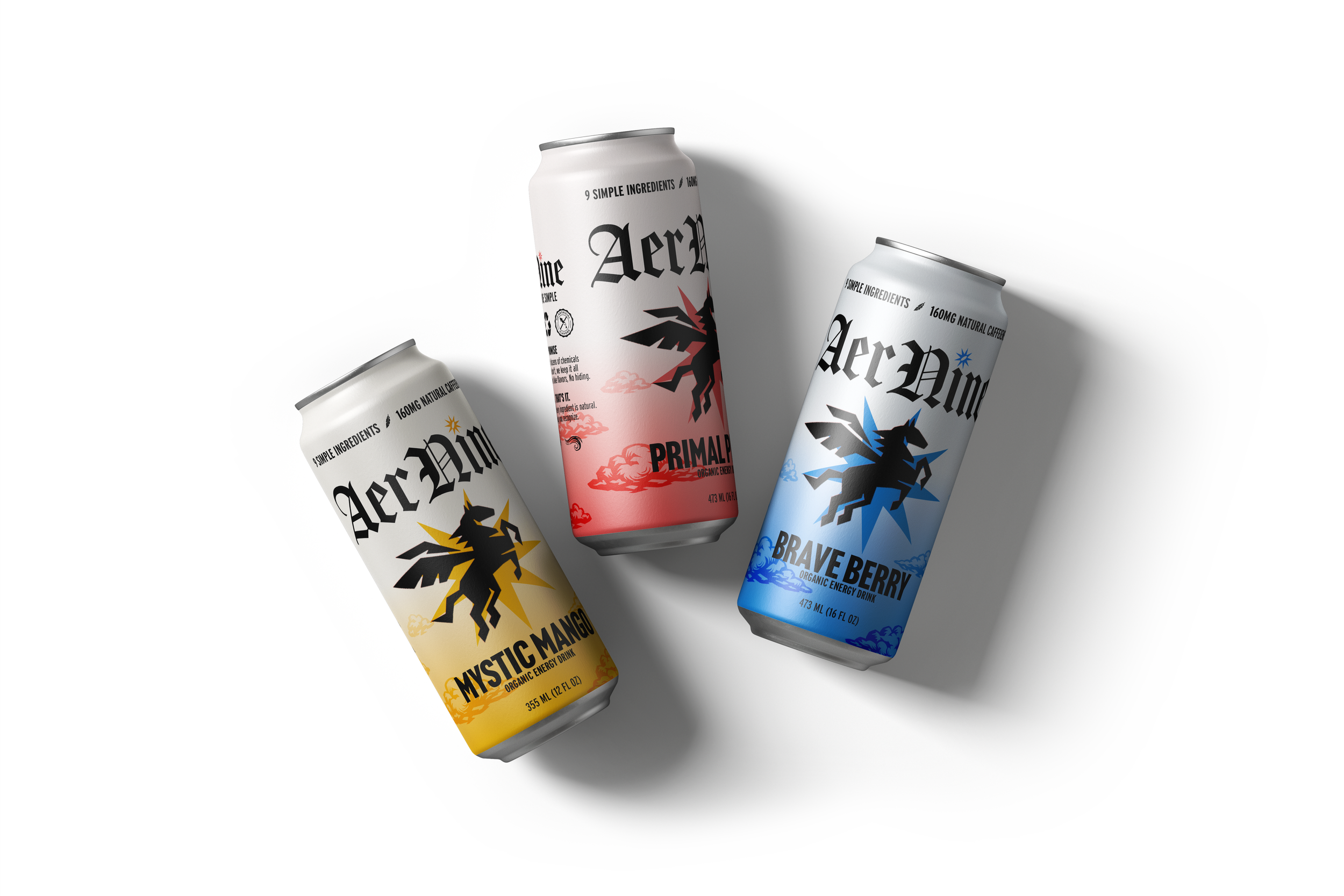
Solution: Over winter break I spent a little under two weeks working on a fictitious energy drink brand named AerNine. In this way I could practice my photoshop skills and practice on building a brand identity.
Personal Project / Practice
AerNine Energy
Industry: Graphic Design
Date: December 2025
Tools: Photoshop
PROCESS
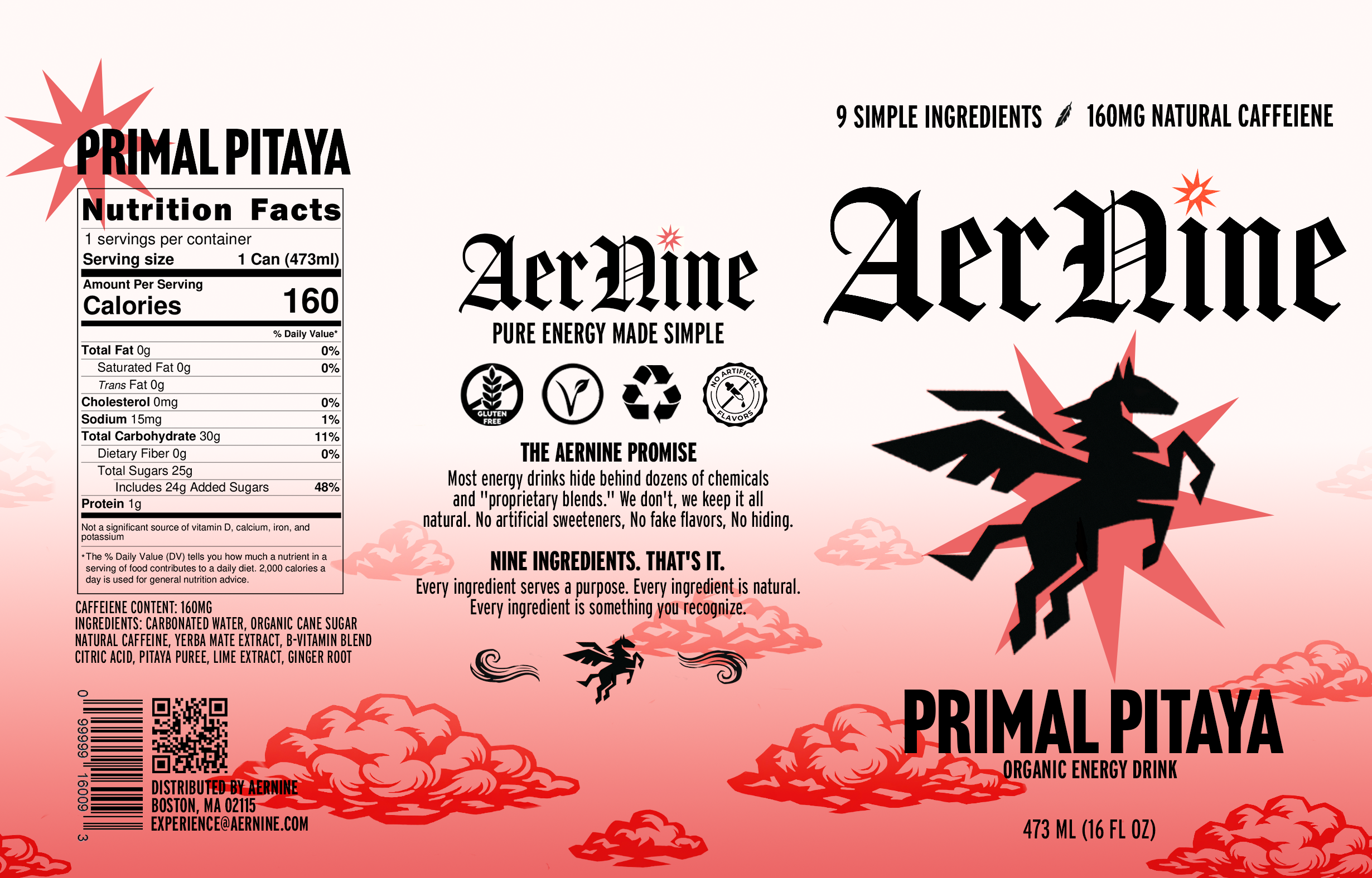
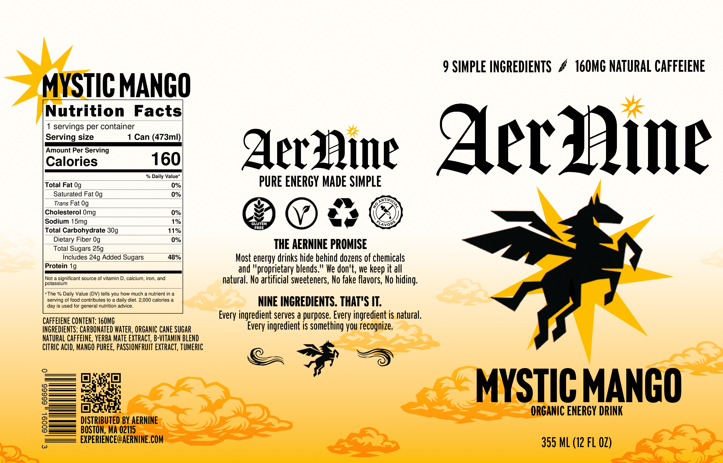
REFLECTION
This project has allowed me the opportunity to push myself in Photoshop, which previously i was very unfamiliar with. Along with that it has also taught me about packaging desing works for cans and the different design elements that go into it, along with presenting brands in a deck format showcasing the full identity system in a cohesive way. If i had more time i would'ev explored more variations in the can design itself and played with it some more, particularly a different label and seeing if it looks better on different cans sizes. Other than the technical stuff, I think this project has definitely benefited me by showcasing the different ways I can go about creating a brand identity from scratch.