

MBTA BUS STOP SYSTEM
Process + Practices
ABOUT
Context: During night-time or in low visibility conditions, many bus riders may miss their rides because drivers rely heavily on sight to determine whether someone is waiting at a stop. I was tasked with designing an interactive system that would address this issue and make it easier for rider to signal buses.
Users: The solution benefits a wide range of people including late night riders, elderly passengers, students and even bus drivers. Anyone who struggles to be seen at a bus stop or even just wants reassurance they won’t be skipped can use this system and the features are designed for all different needs.
Industry: UX & UI Design
Tool: Figma
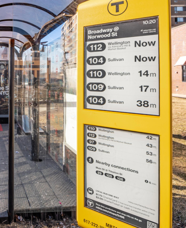
Solution: I Designed a digital screen station for bus stops that provides route information, a map, a time clock and the key feature: a check in system. This allows passengers to notify bus drivers that someone is waiting at a stop coming up, which is similar to pressing the stop button inside the bus however it’s just an external signal rather than internal. The goal was to ensure bus drivers never accidentally pass a rider waiting in the challenging conditions mentioned.
Date: March 2025
FIGMA PROTOTYPE
The video showcases my prototype which follows how a rider would interact with the device. In this example, the user selects Route 10, views upcoming arrival times, and confirms their desired bus. This confirmation sends a signal to the driver, ensuring they won’t be overlooked.
All routes follow a similar flow, simple and clear. Accessibility guided many design decisions including the large touch targets, cold colors, and minimal text to make the interface intuitive even for first time users. My goal was to create a system that could realistically function in a public environment and support riders who may be worried they’ll be skipped, or in a rush or impaired in some way.

ELEMENTS
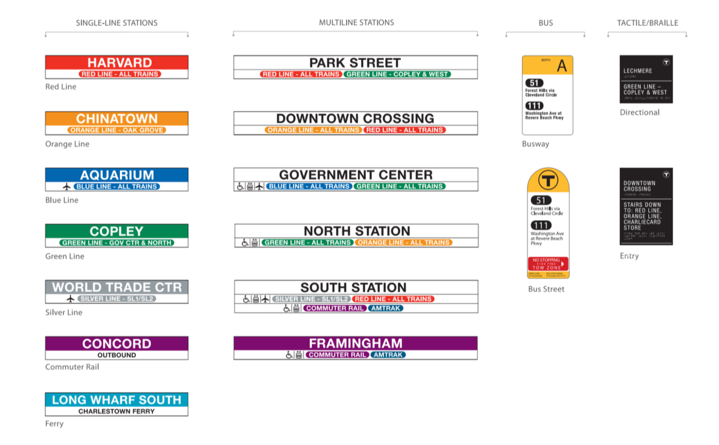
I intentionally designed this system to fit within the existing MBTA visual language. To create something that felt authentic and instantly recognizable, I utilized the current signage system, which included it’s typography, color palette, icons and over structure.
By using familiar elements such as the official typeface, rounded buttons and the MBTA color system, the interface feels both cohesive and believable. This approach also improves the riders usability as they don’t need to learn a brand new system, making the transition if it were to happen in real life feel seamless and intuitive.
PROCESS
This project was inspired by the non-touch screen transit signs that Boston has recently installed at various MBTA bus stops. I wanted to expand on this system by designing an interface that not only displayed route information and times, but also provided additional features that would support accessibility and rider safety especially at night or in low visibility.
For future iterations, I would explore making the map fully interactive. At this stage, the display shows the entire route information in a static way. However with an update users would be able to zoom in and view details about stop location, and get even clearer guidance and reassurance of when their bus is approaching.


REFLECTION
Overall I believe if implemented correctly this new interactive device would make people feel greatly at ease knowing that they will get picked up, something that is also a plus for this is that if people don’t want to use it they don’t have to. It purely based off if they want that extra reassurance.
Utilizing the already existing visual system for this project really enhanced the final product rather than making something from scratch, which plays into it not disrupting an already existing system. To get a better scope on how this would work in the real world, it would need to be implemented on a couple screen within boston or even just shown to students who take the bus regularly and receive data based off of that. For this project I didn’t get much feedback so that’s definitely something I wish I got more of in order to enhance the look and feel of the iterative prototype.